
Part 2: Lobby Page and Confirmation Emails
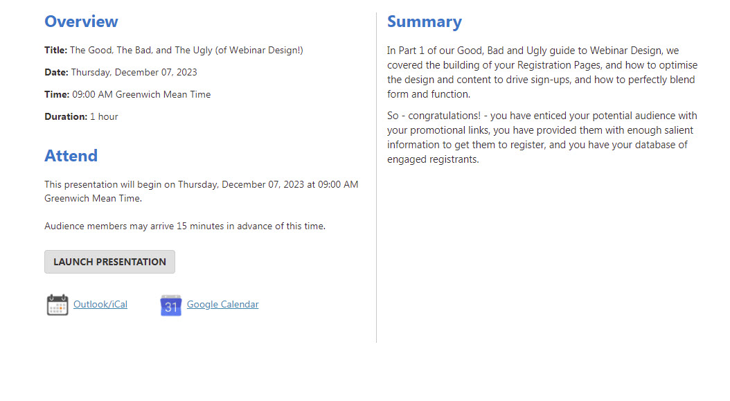
In Part 1 of our Good, Bad and Ugly guide to Webinar Design, we covered the building of your Registration Pages, and how to optimise the design and content to drive sign-ups, and how to perfectly blend form and function.
So – congratulations! – you have enticed your potential audience with your promotional links, you have provided them with enough salient information to get them to register, and you have your database of engaged registrants.
But now what?
Well, although you have won the battle for registration, the webinar war is far from over, as you now need to convert your registrants into live attendees! And this is the first stage where – if you don’t put a similar level of thought and effort into your Lobby Page and Confirmation Emails – you can experience a ‘fall off’ from your registered numbers, to your final Live Attendee figures.
We are here to help you go above and beyond the average conversion rate of 35% to 45%, in order to hit (or exceed) the average conversion rate of 55% that most of our events reach!
What happens when someone registers for my event?
As soon as the visitor to your Registration Page clicks on that all-important ‘Register’ button, two things will happen simultaneously:
- They will be navigated to your Lobby Page
- They will be sent a Confirmation Email
But please don’t make the mistake of thinking that just because someone has registered, that you can take it for grated that they will attend; you still need to nurture and engage your potential audience!
THE LOBBY PAGE:
Think of your Lobby Page as the departures lounge at the airport; do you want your guests sitting on uncomfortable benches, drinking a warm Coke and staring at a blank wall? Or would you rather they be sat in the first-class lounge on a leather sofa, sipping champagne and enjoying the art on the walls?
The Lobby Page is another chance for you to get your registrants excited about the online journey you’re asking them to take.
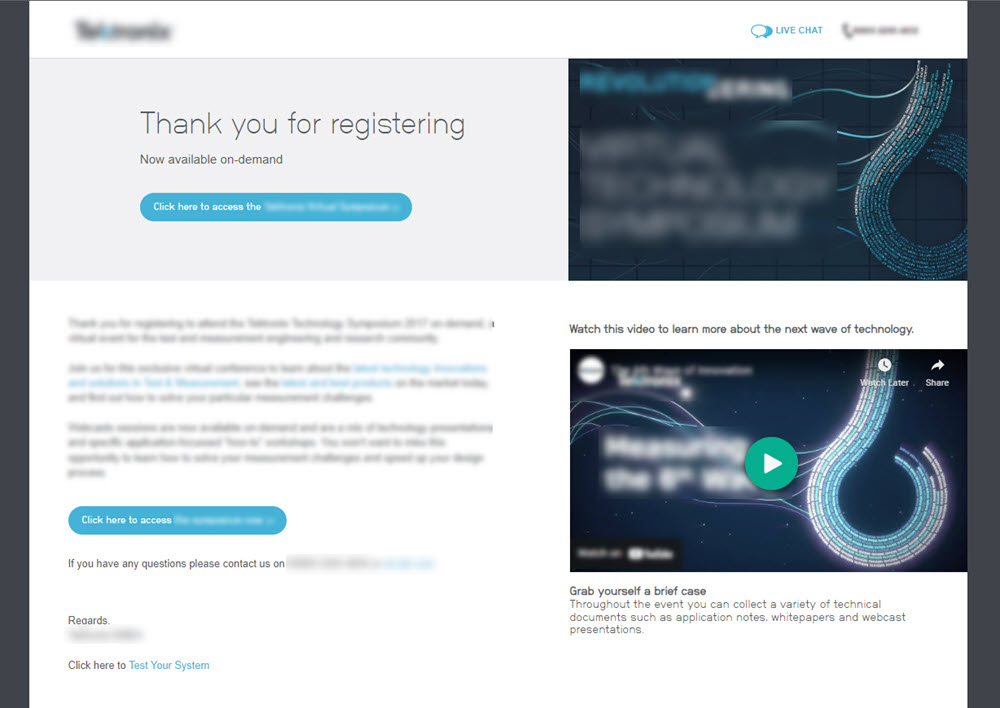
A poor Lobby Page offers nothing of interest to your registrants; it takes their attendance for granted, even though it is far from guaranteed at this point! It is bland, block text, and entirely uninspiring. Such an example can be seen below:
The BAD
So how do you avoid this, and provide a first-class Lobby Page? Well, whether your registrants view the Lobby Page for 30 seconds or 30 minutes, you want them to be enticed, intrigued and excited about the webinar journey that awaits.
The best Lobby Page content is different from the information you’ve presented on the Registration Page, as you want to be drip-feeding your potential Live Attendees with just enough content that they can’t wait to view your webinar in its entirety.
So, rather than showing them what they’ve already seen, why not mix it up and show a short, embedded video clip? Or provide a detailed agenda directly on the page or as a PDF download? Or provide additional information on your company or keynote speakers?
The GOOD
It’s also great practice to include a one-click calendar reminder too, so even if they’re signing up weeks in advance, you’re already there in their calendar, waiting to remind them of your event.
On the subject of event reminders…
THE CONFIRMATION EMAIL:
The best events are actively promoted weeks before they’re due to go-live, but while this is great for your marketing outreach and awareness campaign, if someone registers for an event weeks (or even months) in advance, then they’re unlikely to be sat attentively in front of their screen – remembering exactly why they registered in the first place – at the exact right time, based on memory alone.
That’s why you need to have a Confirmation Email that can serve as a one-stop-shop for all the key event details, and provide them with another one-click route to adding the event to their calendar.
So, what makes a good Confirmation Email? Well, let’s start with…
The BAD
The below is a very poor example of a Confirmation Email, just like with the Lobby Page, if a registrant isn’t excited by what they see at this stage, then they are far less likely to actually attend.
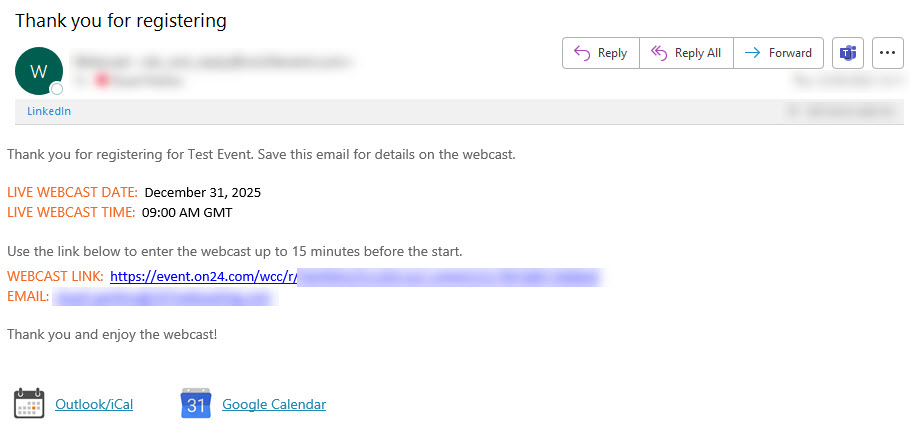
As you can see, this is bland, uninspiring, and has nothing to draw the reader’s eye in to the content. It’s basically the digital equivalent of letter from your local council about bin collection dates! The information may be important, and you appreciate them sending it, but it’s hard to read without wanting to yawn.
You want your Confirmation Email to be representative of your brand; you’ve likely invested a lot of time and energy into creating a vibrant, dynamic brand, and you want your communications to reflect this!
But at the same time, you don’t want to fall into a style-over-substance trap, so all the key event information needs to be contained.
Here’ how we do it…
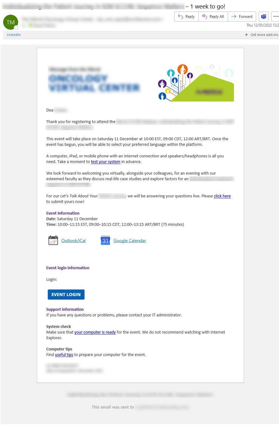
The GOOD
At 247 Webcasting, we elect to build all of our emails from the ground up in HTML. By doing it this way we can make them look and feel truly representative of the brand – in terms of colourway, logos, and tone – while presenting all necessary information in a way that naturally leads the reader to engage with the content.
We can include the key elements that the registrant may need, such as:
- Date
- Time
- Duration
- Type of event
- Agenda
- Speakers
- Any certificates or accreditation such as CPD
And we integrate the key information with your own branding, co-sponsor logos, banners, and backgrounds, and anything else you feel may be beneficial.
We also include that all important Add-to-Calendar button again!
If you follow the above advice or, better yet, let us build everything for you, then your Lobby Page and Confirmation Email will be designed in such a way that you’ve already maximised your chances of converting your registrants to live attendees; so, what next?
Remember your Reminders! (Those all-important digital taps on the shoulder for your potential attendees)
And we’ll be covering Reminder Emails in the next instalment of The Good, The Bad and The Ugly (of Webinar Design!)
Missed part 1? click here to read.